Hands-on Vision Science: Chromodepth with Crayola's sidewalk chalk
In which I investigate how one of Crayola's cooler products turns colored chalk into 3D art.
During the summer months, one of my lab’s main activities (along with my wife and colleague, Dr. Erin Conwell) is going to community events to spread the word about our various studies that kids can take part in. This generally means that we set up a table in a park alongside other organizations (local museums, the occasional petting zoo, if we’re very unlucky we’ll be next to the corndog vendor) and try to show off some of the cool stuff we do in the lab so folks will sign up to hear more. Over the years I’ve tried a number of different activities to hold kids’ interest and get families to check us out, but now I’ve settled on a strategy that seems to reliably work: Weird goggles.
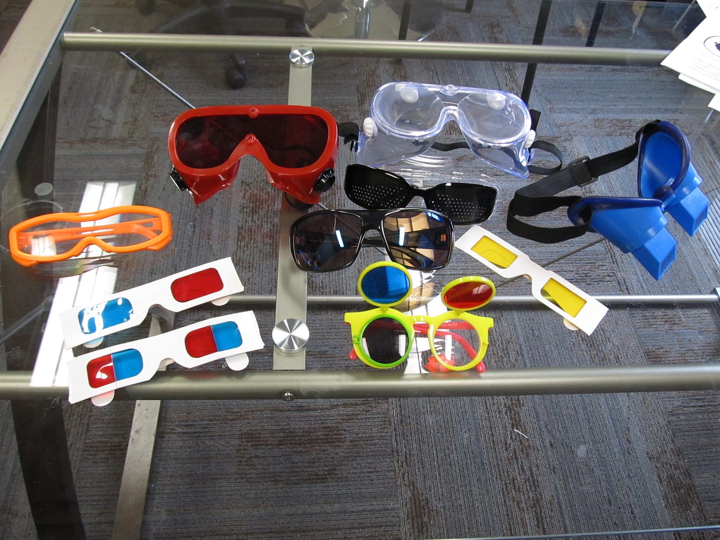
It turns out that everyone loves looking through glasses that make the world look different and I’ve accumulated a number of different options for people to try out. In the image above, you can see my current lineup: We’ve got your standard red/cyan anaglyph glasses, a version of those that I modified to split the red/cyan color by visual field rather than by eye, glasses for simulating color-blindness, EnChroma glasses for ameliorating color-blindness, prism-shifting goggles, inverting goggles, glasses with one eye darkened so we can induce the Pulfrich Effect, pinhole glasses, and red-filtered glasses for maintaining dark adaptation. Believe it or not, there’s more where these came from!
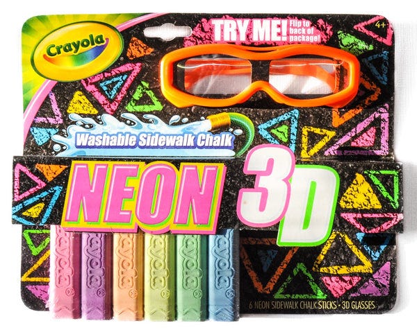
This past week, I threw another pair of glasses into our trusty wagon to tote to the RiverArts event in Moorhead: Crayola’s 3D Sidewalk Chalk glasses. I bought these a long time ago because I saw “3D” on the box and couldn’t help but be curious, but I hadn’t really done much with them since. To be honest, I wasn’t sure if I’d *ever* actually tried them out to see what they did, so what better time than now to find out? At the park, we did our usual routine with the prism-shifting goggles and a ring-toss game, accompanied by inverting goggles and…well, anything you do is weird with inverting goggles on so we just played by ear. We did bring a small chalkboard, though, and I wrote and drew a few things on it in different colors and left the glasses hanging from the easel we set the board on. Late in the evening, a few kids came back to our table to try more inverted-goggle throwing and one of them drifted over to the chalkboard. “Hey - go ahead and try out those orange glasses.” I said to her. “Tell me if you see anything neat when you look at the board.” She put them on and her reaction was instant. “Whoa. These are CRAZY!”
What you see when you put the glasses on is chromodepth, which is a fancy way of saying that different colors appear at different distances from you. With the Crayola glasses, reddish colors will appear to be floating closer to you, while bluish colors will be sunken into the surface away from you. The young woman at our chalkboard was immediately curious about what would happen with other colors, and set to trying out yellows, oranges, and greens while drawing cubes and other geometric shapes (including that Cool S symbol me and my friends used to draw on desks!) After a while, I asked to take a look at her handiwork and I had to admit, the induced depth was pretty freaking cool. I took a quick look at the glasses before giving them back, because I had to admit that I didn’t know what exactly was going on here: I teach my students about monocular and binocular cues to depth in my Sensation & Perception class, but looking at the uniform surface of these glasses and considering the lack of any disparity information in the 2D chalk drawings, I was a little stumped. The box suggested that the glasses worked with the chalk, but that was easily contradicted by looking around at other red and blue things: regardless of whether I looked at the chalk or not, red stuff was a little closer and blue was a little further away. “It’s really weird looking at regular stuff,” said our visitor, “because it’s all jumbled up where the different colors are.” So what gives? How do these glasses turn ordinary crayons, chalk, or any other source of different colors into systematically different depth planes?
First, let me say a little bit about how depth perception works when you have binocular disparity available to you - this was what I assumed wasn’t happening with these glasses for reasons that should become obvious in a moment. Here’s the deal: When you look at something out there in the world, your two eyes make a vergence movement so that the thing you’re looking at is right in the center of both your left retina and your right retina. That is, you probably go just a little cross-eyed when you look at something, with your eyes more crossed if that object is close and less crossed if it’s further away. Ask a friend to look at the tip of a pencil while you move it closer to and further from their face and you can see this happen easily. Once you’ve made that vergence movement, something interesting happens that’s a direct consequence of things at the world being at different distances from the thing you’re looking at and the fact that your eyes are turned a bit. Take a look at the diagram below, which depicts a shape called the horopter, and I can talk you through it.
The horopter is the locus of points that will appear at the same positions in the left and right retina as you fixate at a specific point in 3D space. Here, the observer is looking at “3” and the lines from each digit show you how these points end up projected into the left and right eye based on the observer’s vergence and the fact that light must pass through the pupil to get to the retina. Image credit: Rainer Zenz, CC BY-SA 3.0 <http://creativecommons.org/licenses/by-sa/3.0/>, via Wikimedia Commons
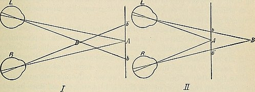
Light from objects in the 3D environment has to get into your eye so you can see it, and the only way for it to do that is through the pupil. That means we can trace the rays from objects out in the world through the pupil and onto the retina of the left and right eye to see where they end up. If those objects were on the horopter, we’ll see that they end up in the same spot in the left and right eye: the number “5” in the diagram above is off to the left of “3” in the right eye and the left eye, for example, and it’s off to the left by the same amount. But what if objects aren’t on the horopter? That’s what you can see in the diagram below, where we ray-trace objects that are both further from us and closer to us than the point we are looking at.
Image credit: Internet Archive Book Images, No restrictions, via Wikimedia Commons. William Howell, A Text-book of Physiology, for Medical Students and Physicians.
The key phenomenon to pay attention to here is that if we’re looking at “A",” a point closer to us than that ends up with rays that land on different spots in the left and right eye. You can see that “B” in the left diagram projects off to the left of “A” in the left eye, but it’s off to the right of “A” in the right eye. The situation is reversed if “B” is further away from us than “A":” Now “B” ends up off to the right “A” in the left eye, and off to the left of “A” in the right eye. The difference in where “B” is in the left and right eye is called binocular disparity and it’s information your visual system can try to use to work backwards from what is on the left and right retina to a guess about where things might be in 3D relative to where you’re looking. If the relative position of an object in the left and right eye is like what’s happening in the left diagram above, then it’s probably the case that B is closer to us than A. If the situation is more like the right diagram, it’s probably further away from A. Your visual system’s willingness to use this information for these depth estimates is why standard 3D glasses work: We make two images that have objects presented at different left/right positions in a way that’s consistent with what would actually happen if the light from those objects was coming from stuff arranged in 3D. We deliver those two images independently to the left and right eye (either using color as a means of letting each eye only see one image, or other tricks like polarized light) and your visual system does the rest. This is how those Magic Eye images work, too - there are two copies of the same image with disparities introduced by shifting parts of the image around, and either crossing or uncrossing your eyes so each eye only gets one image lets your visual brain do the same work of recovering depth information.
Pretty cool, but I thought this couldn’t be what was going on with my Crayola glasses because the red and blue chalk was all on the same flat surface! There shouldn’t be red and blue light ending up on systematically different parts of my left and right retina because it isn’t coming from a different spot in depth! Again, what gives?
My next thought was that this could have something to do with another cue to depth that I like teaching my students about: chromostereopsis.
Image credit: Fred the Oysteri - The source code of this SVG is valid. This vector image was created with Adobe Illustrator., CC0, via Wikimedia Commons
In the image above, you may see the red parts of the image as floating a little above the blue parts. This doesn’t work the same way for everyone, though: Some people have only a very weak or absent effect, and some people will even see the opposite. To the extent that you do see a difference in depth between the red and blue parts of this little scene, you’re experiencing chromostereopsis for yourself. This might also seem to be a bit of a puzzle to you based on my description of binocular disparity above because we still only have a 2D surface that shouldn’t be giving us red and blue stuff in different parts of the left and right retina. The thing is that we need to be a little careful with that assumption as well as thinking about some other cues that your visual system might use to try and estimate depth from what the world looks like on the two retinae.
Chromostereopsis is simple to describe as a phenomenon, but has a lot of interesting complexity as you start examining why it might happen. I’m going to talk about two different contributing factors to the percept of depth from color, both of which follow from an important optical fact: Light of different wavelengths (which you can use here interchangeably with color, BUT I would lose my vision scientist card if I didn’t warn you that this isn’t generally true!) refracts, or bends, by different amounts when passing from one medium into another. If you’ve ever spent much time doing photography or using telescopes, you might have some intuition for this because of a phenomenon called chromatic aberration. Because light of different wavelengths refracts by different amounts, lenses generally don’t bring different colors into focus at the same point. As an amateur astronomer who could only afford cheap lenses for my telescope, this means I saw a lot of rainbow fringes at the edges of the moon. The white light reflected from the moon’s surface got to my bargain-basement lens, which promptly bent the red, yellow, green, and blue light making up that white moonlight by different amounts, spreading the colors out spatially by the time they got to my eye.
Chromatic aberration happens because light with different wavelengths, which we experience as different colors, bends by different amounts when passing through a lens. Incoming white light tends to turn into a rainbow as a result. By DrBob at the English-language Wikipedia, CC BY-SA 3.0, https://commons.wikimedia.org/w/index.php?curid=46592651.
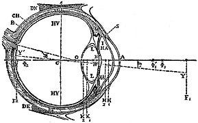
This has two consequences when we apply it to the optical system that is our eye. The first one is (I think) straightforward to think about once I tell you about a property of how our eyes are arranged in our head. This property has to do with two lines we can draw to determine unique axes within the eye: The optical axis and the visual axis.
The optical axis is easy to think about if you look at the eye in cross-section: Draw a line that’s perpendicular to the cornea (that is, it goes straight into the center of the eye) and passes through the center of the pupil on its way to the back of the eye. The visual axis is different: This line connects an object in space, the center of the exit and entrance pupil, and the foveola of our retina. The important thing we need to know about these to axes (which you can see in the diagram above) is that they aren’t the same line. Specifically, there is an angle (called kappa) between them that is about 5 degrees or so. This matters because refraction doesn’t just depend on the wavelength of light that’s passing through two media, but it also depends on the angle of the incoming light relative to the interface between those two materials. Light rays that are perpendicular to the surface won’t bend, but as that angle moves away from perpendicular they will bend more. The difference between your optical axis and your visual axis means that there is room for red light and blue light to refract systematically by different amounts in your left and right eye, which in turn introduces binocular disparities on the basis of color! The fact that the fovea is temporal to the end of the optical axis in each eye (further out towards the side of your head) should mean that red light ends up interpreted as closer to you than blue light.
There is another consequence of how refraction works as a function of wavelength that also probably contributes to chromostereopsis. Besides potentially ending up in different spots on the left and right retina, the fact that a lens won’t generally focus red light and blue light at the same spot means something else will happen that I think is a little simpler to explain: One of those two colors has to look a little blurry to you. This matters because blur is a monocular cue to depth that your visual system also uses to make guesses about relative 3D position. Take a look at the picture below and you can see what I mean pretty easily - the background looks super blurry compared to the foreground. This is happening here because the camera in question has limited depth-of-field and so does your eye! The result is that blurry stuff usually is at a different depth from the point you’re fixating, so your visual system happily uses this to try and make guesses about depth, too. This one is a little ambiguous though, because blurriness can mean both that an object is further from you than the one you’re fixating on or that it is closer to you! The visual system’s integration of this defocus cue with the induced disparity described above may be why perceptions of chromostereopsis vary across individuals. That is to say: It’s complicated.
Image credit: By NightWolf1223 - Own work, CC BY-SA 4.0, https://commons.wikimedia.org/w/index.php?curid=118009181
All this does give us the tools we need to understand how the Crayola 3D glasses do what they do, however. The key trick is to exaggerate the induced disparity of different wavelengths of light - remember, in your eyes this comes about because of the relative angle between the visual axis and the optical axis. To systematically spread different wavelengths out into different disparities, we need the light to come in at an angle so it refracts. We don’t need to rely on that Kappa angle I mentioned above if we’re willing to give people an optical aid, however! Instead, we can just put prisms in front of your eyes to spread those colors out even more. That turns out to be exactly what Crayola’s glasses do - each side has a prism in front of it with surfaces that lead incoming light to be refracted so that short-wavelength light ends up with different disparities in the two eyes than longer-wavelength light. The key is to use the same prisms in the left eye and the right eye, but with the orientation of the prisms flipped so that the same wavelengths end up shifted nasally (in towards the nose) and temporally (out towards the side of the head) in each eye. If you look at a white light source through the left and right side of the glasses, you can see this happening. It was a little hard to photograph, but if you check out the pictures below of the fluorescent tubes in my office, you should be able to see the effect.
The bottom images are zoomed-in and have increased saturation so you can (hopefully) see the difference between the left-eye view and the right-eye view. In the image at left (which is through the right lens of the glasses) you can see that the dark lines have reddish light off to the left and blue off to the right. In the other image (through the left lens of the glasses), the opposite is true. I’ll leave it up to you (or your students, if you teach S&P!) if you feel like going back to the horopter and seeing why this means warmer tones will look closer to you and cooler tones will look far away.
So there you have it: With just a little bit of optics and some vision science, we can work out how a really nice art product achieves a beautiful visual effect. Sadly, Crayola discontinued these glasses back in 2014, which I found out when I wrote to their Customer Service department to see if I could buy a whole bunch of them. Luckily, there are a number of places to get cardboard versions of the same thing, so if you’re also inclined to collect weird goggles, you can easily buy yourself a few pairs and make your own chromodepth masterpieces. Also, if you want more detail about the technical aspects of how these work, you can check out the patent online. Believe it or not, it’s pretty fun reading.
Thanks as always for reading and stay tuned for more Science Writing from the Frozen North!


